On our recent trip to London we took in a few of the capital’s retail incarnations. We generally stay away from store openings preferring to wait until the fuss has died down so see how a store is really operating and if all the fuss is worthwhile.
Primark
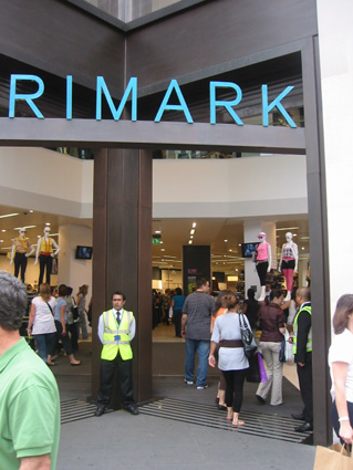
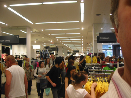
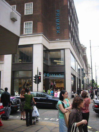
Our first destination was Primark on Oxford Street. Boy was this place rammed. 11 o’clock on a Friday morning and the place was chock full of girls out shopping. We listened to a few conversations and several groups of friends seem to have made a special trip. What did we do before we could use our mobiles to call our frinds in the same shop and shout, “where are yer?”. Even the security guards, who could have been a bit more friendly, perhaps kitted out in a ’smile you’re on camera’ t-shirt rather than the ubiquitous day-glo waistcoat, couldn’t stop the hordes from ravaging the product, with the queue for the fitting rooms being 20 metres long at least. The environment was perfectly fine, Dalziel and Pow as always do a very good job of creating an environment that can be quickly changed and adapted using graphics and lighting and some good visual merchandising, I particularly liked the black mannequins and mirrored back panels. A store like this perfectly illustrates the point that a value store doesn’t have to look cheap.
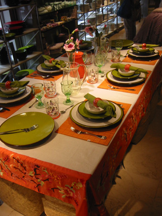
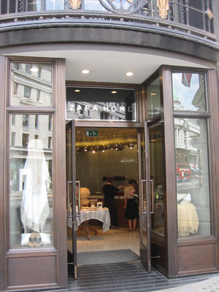
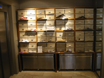
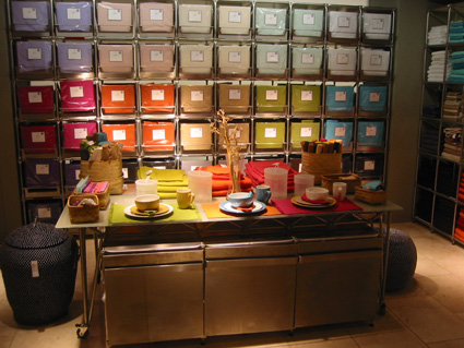
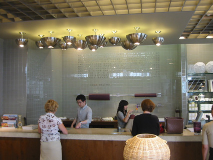
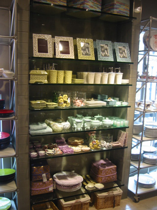
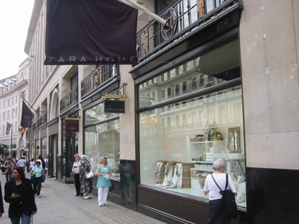
The main focus of Primark really has to be the product. Apart from the homeware department (corner) this was bang on. This is really what differentiates a retailer and makes it a true destination. That’s why there was nobody buying homeware, who wants this kind of beige tat, (piss catcher anyone?) I’ve no idea what kind of customer this kind of stuff is aimed at and of course there was nobody buying which is a shame because it lets the store down. If it was me I’d take it our completely and wait until the basement is done, move it down there and create a much better bought, more on trend, more substantial offer, a destination in its own right. You only have to look at Zara Home (more of which in a later post) to see what can be achieved very simply, what should be sold and how it should be merchandised.
Apologies for the picture quality, especially the side of my head, but you get the gist of how busy it was even on a Friday morning. Strangely Next over the road was pretty quiet and so was New Look. New Look only had one image (that I saw) on the ground floor of Lily Allen despite the launch of her product line only the week before and Next was, well, bland as usual. Dalziel & Pow have just redesigned Next in Bluewater which we haven’t seen yet but hopefully it’ll be a big move on especially the standard of photography, although I suspect it may just catch up to the competition.


Recent Comments